July 2016- July 2018
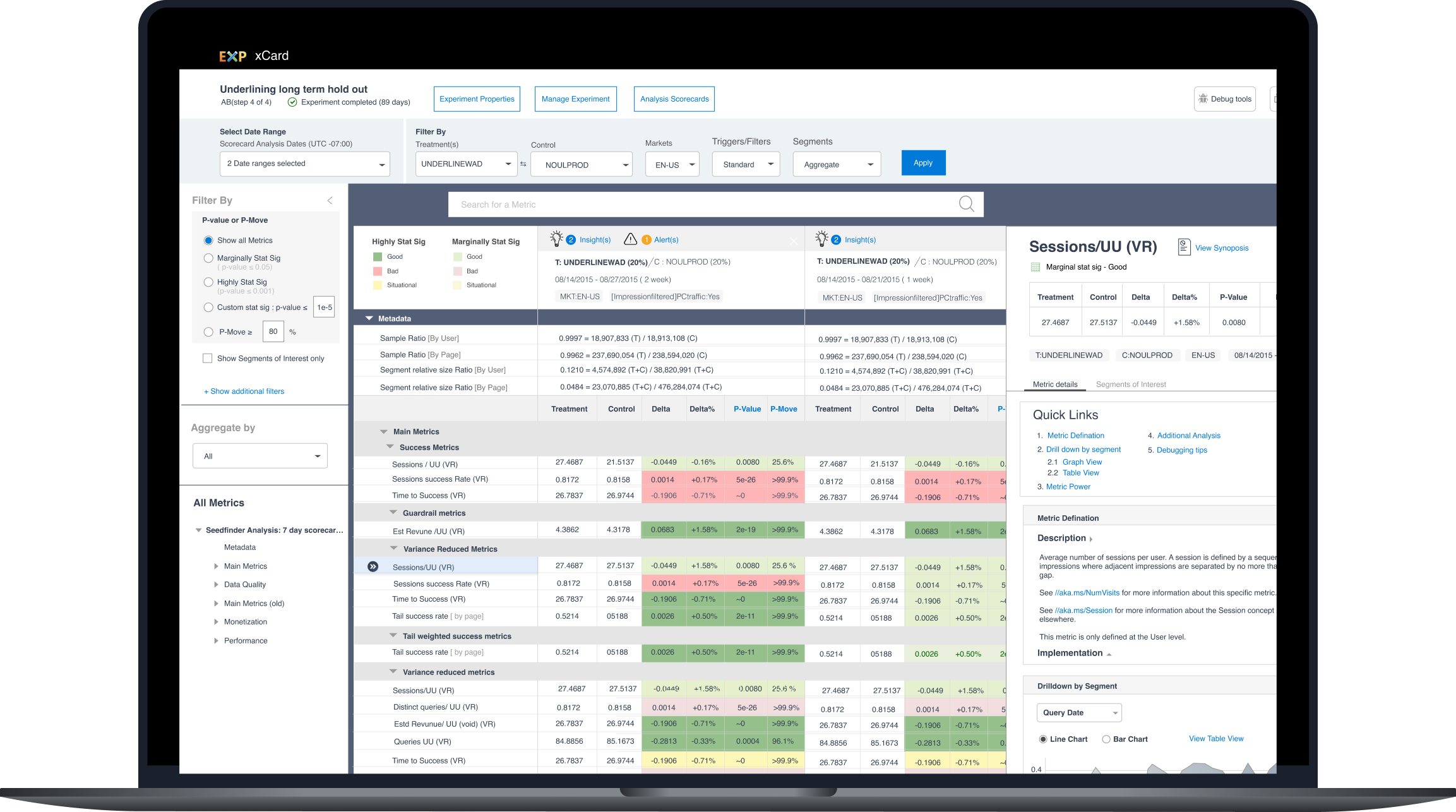
Leading the end to end design experience and introducing design into the software development process. Reading time: 10 minutes The Experimentation and Analysis team in Microsoft is responsible for building the platform for A\B testing across Microsoft. The platform was established in 2009 and is an internal product used by teams within Microsoft to author and run their A/B tests (also known as experiments). The platform is composed of four products namely Microsoft’s internal score carding tool The A/B experiment authoring tool The platforms metrics authoring tool The admin experience for control tower I was the first ever full time UX designer hired to the team and was responsible for all the UX activities across the platform. This was also an interesting challenge since the team structure was as follows Designer Data scientists Developers Program managers When I joined the team, I was surprised to find that a significant number of the Program managers, developers and data scientists had never worked with a designer and no idea how I fit into the development life cycle. To address that, my initial primary objectives were as follows. Meeting with the developers, PM’s and data scientists to identify what their expectations from design Making a list of all the product and feature areas that needed design guidance along with the priority Analyzing the product with user studies to identify key improvements Based upon my conversations with the team and going through the platform, I realized that while the team had strong opinions about the product (especially xCard), none of the feedback or concerns had been cataloged anywhere. I spent two weeks talking to 5 data scientists and one development manager to get their views on the platform. Based upon the conversations, I identified three main areas of improvement where we could look at short term gains. Reducing the number of filters and options available. The list of all the metrics in xCard and how it was surfaced. Details about the metrics performance and variances. These three areas were determined by where the most feedback was as shown in the feedback summary below. [su_image_carousel source=”media: 581,582,583″ slides_style=”photo” controls_style=”light” crop=”none” align=”center” arrows=”no” dots=”no” image_size=”full”] Taking this feedback to leadership, I started to look at how I could address some of the issues. On looking at xCard closely, I noticed inconsistency in colors, fonts, button and form field styles and general UI consistency. On discussing with the development team, I found that since the team never had any design help, the development team often implemented them as they wanted leading to inconsistent experiences. As one of my first tasks, I set out to create a style guide which would serve as a baseline for me for my designs and also the framework for a future component library to ensure design consistency for the development team I also realized that while there was a general idea of how the entire product flowed together, there was no clear defined flow with regards to how everything tied in. Hence one of my tasks was to define an end-to-end scenario map which showed all the integration points between the different tools. Since xCard had the most critical feedback and was the tool used by all the data scientists in the team and the internal customers, taking the feedback from the user interviews conducted before, I created multiple wireframes and presented them to the larger team and leadership team in our off-sites. The feedback taken from the meetings was then used to define the final screens which were handed over to the developers. Post development, I also conducted several usability tests with users to evaluate if the changes proposed worked for them and the improvements we could continue to make. Progressions was a new feature introduced inside control tower on the behest of Microsoft office where they wanted the experiment to run through a series of progressions or stages. The stages would generally involve internal groups before moving on trusted outsiders and then worldwide. Sauron, interestingly named because of how complex and scary the actual experience was. Based upon discussions with the data scientists in the team, I created a new information architecture which was based upon key tasks namely I then printed out the designs as large posters and, in the team offsite, collected feedback by asking people to provide feedback via post-it notes The feedback from the designs lead to the final updated screens as shown below. I also worked on simplifying our experiment authoring experience and used the off-sites to get feedback and iterate and simplify the experience There was a strong push from leadership at the CVP level to stop having the experimentation platform be an internal only product but also an external product which would be available in the Azure portal. I helped design the proof-of-concept screens and scenarios for that. Unfortunately, due to multiple re-orgs and priority shifts, this potential move to make it an external experience never took place, and my skip (Manager’s manager) asked me to move to the Azure ML team to help them with their design needs.
Designing Microsoft’s Experimentation platform
Introducing the Experimentation Platform (EXP)
xCard
Control Tower
Vivace
Sauron
1
40
~50
7
Getting Started
Filtering and Navigation
Metrics slice list
Metric details
Setting up a Style guide


Starting with xCard

![]()


Introducing Progressions– Experiment authoring for Microsoft Office


Taking on Sauron


Experiment authoring


Helping the EXP platform move to the Azure portal


Reorgs and priority shifts
View AzureML Case study